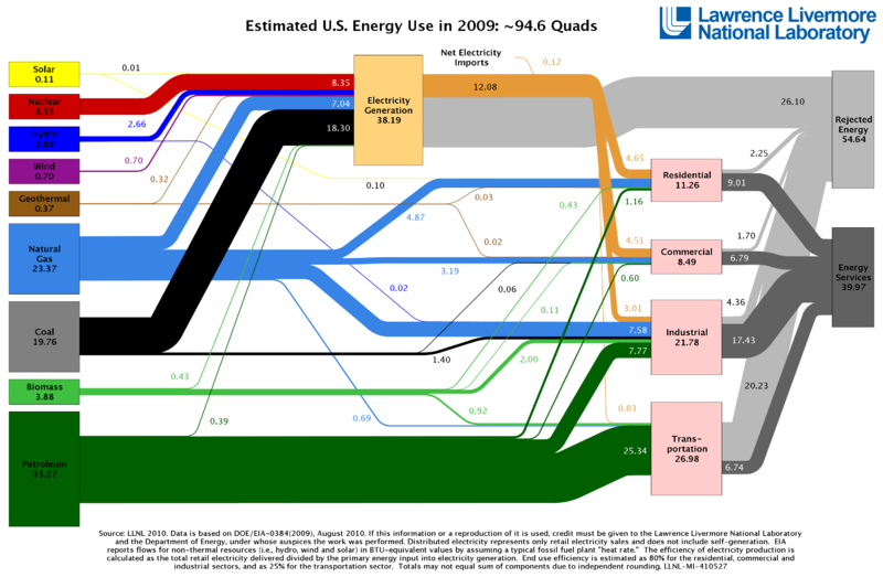
Here is a very interesting chart from the
Lawrence Livermore National Laboratory, that gives a great panoramic view of how energy flows in the U.S (click on it to expand). Note that a quad means 1 quadrillion Btu -- that's 1 with 15 zeros.
Bloomberg.com also has an interactive version of the same graphic, with links to additional information, created by John Tozzi and David Yanofsky --most interesting:
U.S. Energy: Where It’s From, Where It Goes, and What’s Wasted

2 comments:
I'm glad you like the Liquidity Lifeline's data explorer.
I wanted to let you know that I have also made an interactive graphic out of this LLNL data. You can use it here http://www.bloomberg.com/data-visualization/americas-energy-where-it-comes-from-where-it-goes/
David, thanks so much for commenting. I'm going to update this post to include a link to your interactive graphic. Nice work!
Post a Comment